
FINTECH · KYC · CONCEPT
KYC ID upload: audit and redesign
A concept redesign of an ID upload step. I audited the screen, ranked three issues, then designed a guided scan, a selfie step and a clear finish.
- Industry
- Fintech / KYC
- My role
- UX audit and UI design
- Type
- Concept project, not client work
- Platform
- Mobile
Challenge
An ID upload that gives users no help
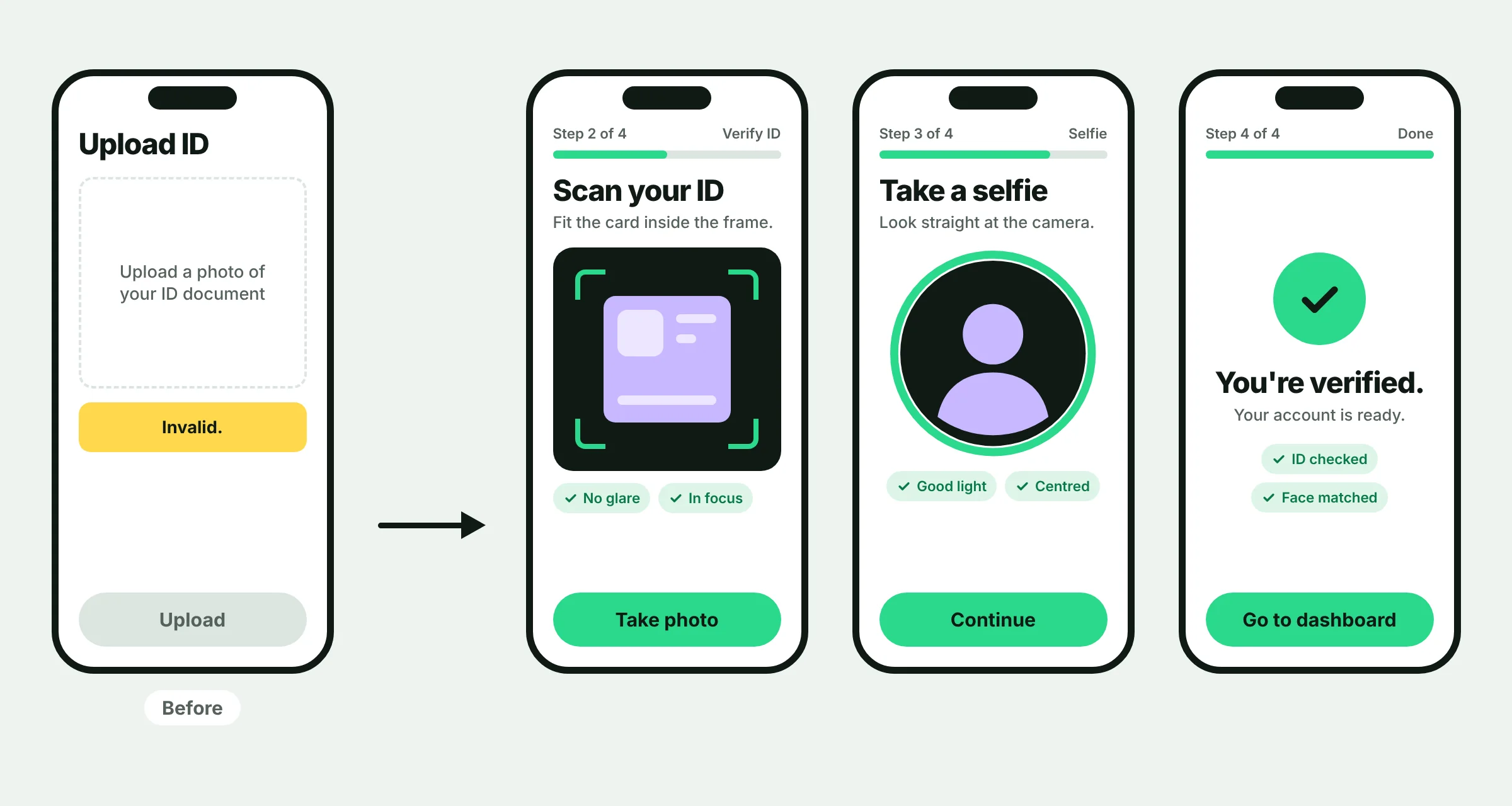
Most ID upload screens ask for a photo and little else. There is no example of a good photo, a vague error appears when it fails, and nothing shows how many steps are left. Users cannot tell what to fix, so they leave. Industry estimates put drop-off at the identity step between 25% and 60%, so one unclear screen can cost a lot.
Approach
Audit first, then redesign
I started with the audit: I reviewed the screen against usability rules and ranked each issue by impact. Then I redesigned the flow around the three issues that mattered most.
- 01
Audit
Three ranked issues: no photo guidance (high), a vague error (medium) and no progress shown (medium).
- 02
Guide
A framing guide, light and glare hints and a visible step count on the scan screen.
- 03
Explain
Errors say what went wrong and how to fix it. The selfie step asks for one action, not a list of liveness tasks.
- 04
Finish
A clear done screen that shows what was checked and what happens next.
Key screens
Results
What this concept shows
- 3
Issues found and ranked in the audit
- 3
Screens redesigned: scan, selfie and done
- 4
Known pain points addressed
This is a concept project, so there are no conversion numbers. In a real project I would measure KYC completion rate, retries per capture and time to verify, before and after the change.
Find out where your users drop off.
Start with a 5-day onboarding audit. You'll get a clear map of what's losing users and what to fix first.
Onboarding & KYC audit
- Flow review and drop-off map
- Prioritized fix list
- 30-minute walkthrough call